
Gallery
The Gallery component provides a reusable pattern for gallery in the interface.
Gallery
-
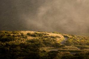
Image with stuff
-

Sed posuere consectetur est at lobortis.
-
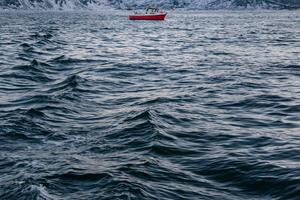
Image with stuff
-
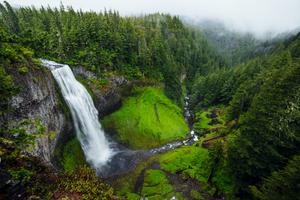
Image with stuff
-
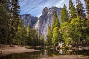
Image with stuff
-
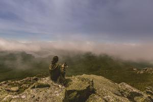
Image with stuff, and a long description provided in the caption field.
API
| Parameter | Default | Description |
|---|---|---|
|
list
|
[] | Array with following keys: largeImage, smallImage, caption and alt |
|
ariaLabels
|
[] | Object with following keys: prev, next |
CSS API
| Variable | Default | Type | Values | Description |
|---|---|---|---|---|
|
--c-gallery--base
|
var(--base) | range | - | Main unit that drives radius and spacing scales. |
|
--c-gallery--space
|
var(--space) | range | - | Base spacing unit. Used for padding and margin inside components. |
|
--c-gallery--color--alpha
|
var(--color--alpha) | rgba | - | Used for overlays. Includes opacity — set both color and alpha together. |
|
--c-gallery--border-radius
|
var(--border-radius) | range | - | Border Radius |
|
--c-gallery--shadow-color
|
var(--shadow-color) | rgba | - | Shadow Color |
|
--c-gallery--shadow-amount
|
var(--shadow-amount) | range | - | Multiplier for elevation shadows. 0 = none, 1 = default. |
|
--c-gallery--corner-shape
|
var(--corner-shape) | select | square, round, squircle, circular, bevel, scoop | Corner Shape |
|
--c-gallery--color--alpha-contrast
|
var(--color--alpha-contrast) | color | - | Used for text and icons on alpha overlays. |
|
--c-gallery--color--surface-contrast-muted
|
var(--color--surface-contrast-muted) | color | - | Derived muted contrast for text and icons on surface backgrounds. |